Can an integrated marketing approach make a measurable difference to the success of a landing page?
It most certainly can, as Adept proved by helping a global non-profit boost critical program sponsorships by 53% with a powerful new program landing page.
How did it happen?
Adept worked to understand the non-profit’s unique program, create relevant content to attract sponsorships, and apply an integrated approach throughout the entire process to create a powerful conversion-focused experience. Here’s the breakdown of the entire process, from start to launch.
Understanding the Non-Profit’s Work
Throughout the developing world, the global non-profit operates critical child survival programs that help young mothers living in extreme poverty give birth successfully. The comprehensive program also aims to support mothers and babies during the crucial first year of the child's development.
This critical program operates off monthly sponsorships by committed donors. To attract these donations, the non-profit uses a standard landing page on their .com site.
Adept’s Initial Challenges
Adept’s task was to redesign the outdated landing page with a brand new design that conveys a full picture of the non-profit’s work while increasing conversion.
At the start of the project, Adept performed a content audit of the current page. This audit uncovered the following barriers to conversion:
- Lack of clarity about how the program operates and what it provides.
- Inability to display all the centers that a potential donor could support.
- Uninspired imagery made the page feel cold and impersonal.
- Lack of decision support content kept skeptical users from donating to a great program.
- Text-heavy content made the page bulky and cumbersome.
- Confusing calls to action left the user surprised by the donation being asked for.
While the non-profit was running a phenomenal program with beautiful stories to tell, the former fundraising landing page was doing little to convey this inspirational content.
Adept hypothesized that showing the breadth and power of the non-profits work would increase conversion on the page.
A Customizable Design for A Customized Program
Beyond the page itself, the way the program operates presented Adept with some interesting barriers to messaging and design.
The non-profit supports a range of centers in 26 developing countries, and may need to quickly change from featuring one to another depending on which needs most support at any given time. And there is no template for all communities.
Additionally, the non-profit would need a way to feature all the centers that a user could sponsor, but have the ability to switch them in and out at a moment’s notice. Functionality and logic would need to play a huge role in the new design of the page.
Conveying all this information simply would come down to content and design.
It All Begins With Research
Adept analyzed the entire site for information on the program, read blog stories from the non-profit about the program, and gathered user testimonies to see was being said about the program.
Then, Adept interviewed the non-profit's subject matter experts to find out more about the program's goals and accomplishments and what people visiting the page needed to know before making a financial commitment.
Research armed Adept with a full picture of the program, the driving factors of the typical sponsor, and the goals of the non-profit.
Bringing the Teams to the Table
With the user pain points identified, it was time to bring together a lead from both the PPC and SEO teams to discuss the page. Jake Kaufman, Adept's Director of Content, explains:
"We knew the page could perform in both those spaces. The interesting thing was to figure out how it would work for each channel."
The goal was to identify keyword volume from organic, along with any searcher intent that we could pull, as well as insight from PPC as to what they would need from the page to use it in their paid search campaigns.
Getting the Message Right
Armed with user research and keyword priorities, the content team started writing and went back to the non-profit a couple of times to make sure the messaging was right. Jake explains:
"We needed to work out how we could change the language while still being true to the organization so we were communicating to people and not to insiders. That's always a challenge for non-profits."
In addition, it was important to the non-profit to show the gravity of the problem in a kind and respectful way, protecting the dignity of the program recipients and providing a hopeful, rather than negative, message.
Focusing on UX with an Integrated Approach
With the copy finalized, Adept laid out a wireframe with user experience and user intent as the bedrock. The agency considered the actions users would try to accomplish and their likely questions, emotions and frustrations as they landed on the page. Jake explains:
"We approached the page as a mini-funnel with lots of content to target different types of users. Those landing via referral and paid search are likely to convert quickly; those coming via SEO efforts may need more information before taking action."
Redesigning the Page
Adept is clear that the company designs around content rather than making the content fit the design, but there were a few features the Adept team wanted to include, says Jake:
"We wanted to see good visuals: bold images of real people, nice treatment of icons (so people could see at a glance how their money is being used and where it's going) and a good scrolling layout so there was always a bit more relevant information as you scrolled down the page."
Here's how that worked out.
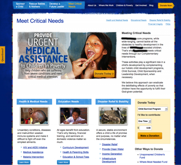
1. Convey the urgency of the situation and provide an immediate action for users ready to donate.
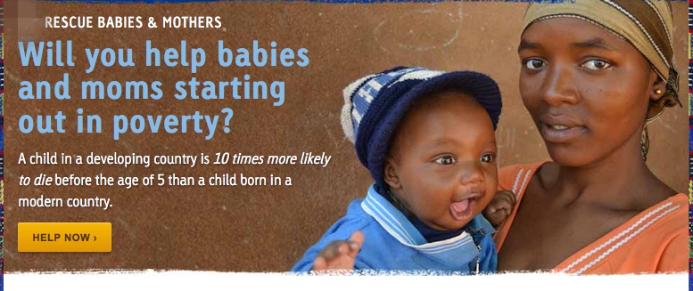
On the former page, a user needed to scroll down before they were asked to make a donation. On the new version of the page, Adept wanted to provide an immediate donation opportunity.
The new content focuses on the user rather than non-profit and invites them to become a part of a world-changing program. The design features a real picture of a mom and baby helped by the program and includes a call to action to “help now.”
This section of the page will likely appeal to those coming to it via paid search or who are already aware of the non-profit. This audience won't have many questions and is likely to make a quick donation based off their allegiance to the brand or an emotional connection to the ask.
2. Provide surprisingly relevant “local-level” content for users who want to know more about program centers.
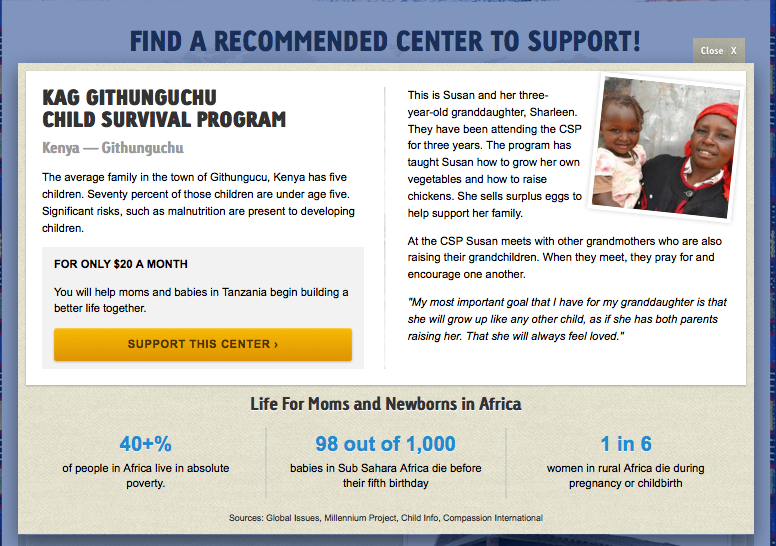
Another challenge for Adept was to find a way to present the large number of centers the non-profit operates. The solution was an interactive world map with blue dots designating each center in need of funds.
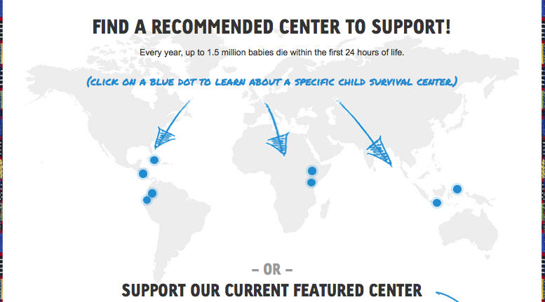
Click on a dot and you get a modal with information about the center and information on the problem in that area and a success story featuring a real mother and baby the non-profit has helped.
There is also a call to action to support the center. Below that there are additional statistics on issues for mothers and babies in the area. The effect of all this is to give a snapshot of the community, the problem and the change that donations will bring.
This is where Adept got a bit fancy. Each center in the map can be changed by the non-profit in an instant. That means that each modal will surface a local story, information about the community and stats about the quality of life in that region!
3. Predominantly highlight a strategic center on the page.
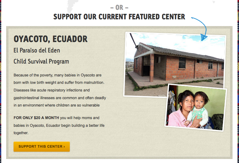
The page also includes a profile of the featured center, which the non-profit identifies as a priority via its internal metrics. The result is that people landing on the page can choose to sponsor a particular country or region or just help the non-profit meet its goal for a particular center. The different CTAs reflect this.
4. Help Users Understand What Their Donation Provides for Moms and Babies In Developing Countries.
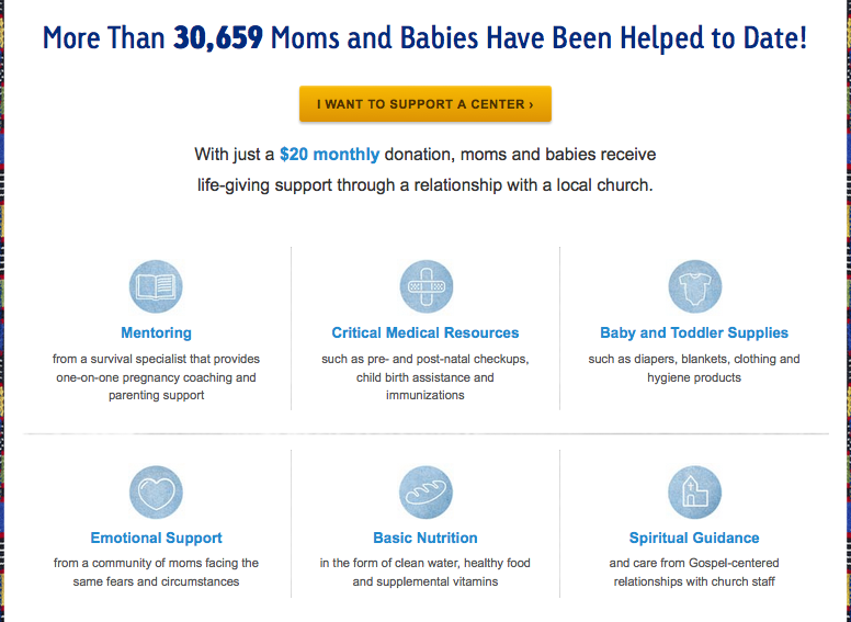
The icons and short titles, along with a brief explanation, give a quick guide to what people are supporting with their $20 monthly donations. The aim here was to convey it quickly and visually without taking up a lot of space on the page. These needed to be more than bullet points, but didn’t need to be long paragraphs.
5. Show Them That The Program Works. Really, really works.
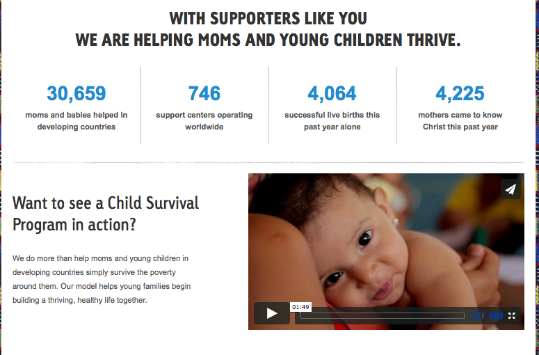
It was also important to put in proof stats to show that this non-profit is trustworthy. Adept broke the stats down into the number of centers, the number of healthy births, and the number of people coming to know Christ (an important metric for the non-profit) to show that the program works. Importantly, a simple graphic shows how donations are spent.
This part of the page includes a video showing the program in action for those who would rather watch video than read.
6. Deliver Transparency To Build Trust.
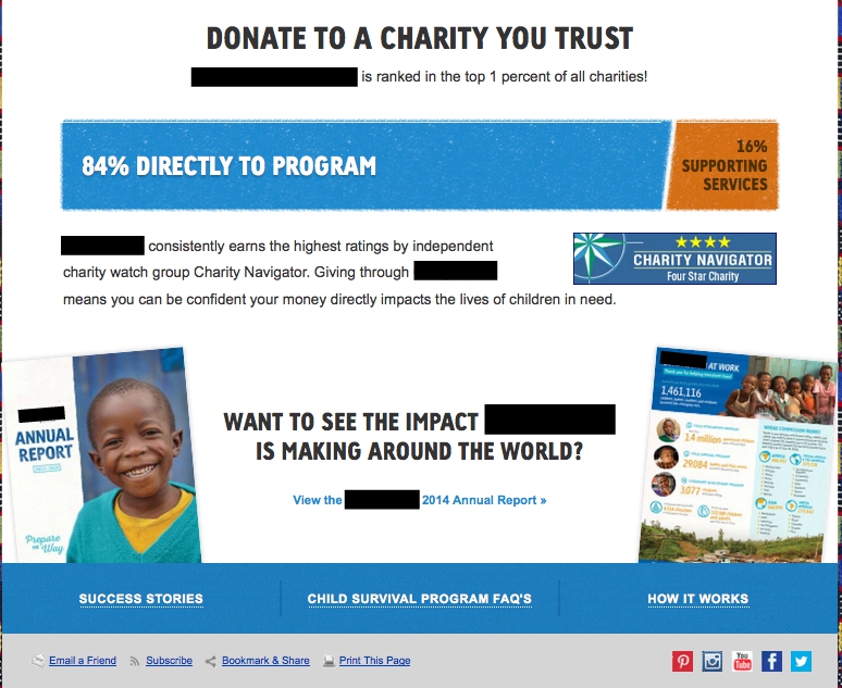
Finally, those who want to learn more can download a report to see exactly how the organization spends its money and what the impact of the program is.
Jake comments: "It is critically important to provide trust factors, especially for the first time donor. Anytime you are asking people to give their money to something you have to address the transparency issue."
Proving The Concept
It was important to Adept and the non-profit to have measurable, statistically significant results before changing the page.
The agency used an audience of 8,000 to A/B test the new page against the old page. Half of the audience saw each version and the new page resulted in a 53% increase in monthly commitments on this page, a key goal for the organization.
Adept's own analysis suggests that the results came about because of the strategic, integrated approach. The team thought about the page from the lens of the user first, then layered on its expertise on how people behave based the channel they come from or the need they have. Jake adds:
"We supported the program’s incredible work and inspirational story with great design, SEO research, user intent analysis and significant testing to make sure this was a winning result for our client."
3 Key Takeaways
If you're planning a page redesign, here are three things to learn from this non-profit case study:
1. Strategy matters. Don't be trapped by needing a project or page. Think about what you are trying to accomplish and build a good strategy around it.
2. Take an integrated approach. Think about design, user experience, search engine optimization and paid campaigns.
3. Quality content is important. Content isn't just words on a screen. Content is the relationship people have with your brand based on an experience they have online.
Jake sums it up: "It's not enough to mention your service or talk only about what you are doing. You want to deliver authentic, practical, applicable content that answers real questions, meets real needs and offers real proof. That's when you start seeing real results."